business card

Amazing Business Card Design Ideas That Clients Wont Throw Away

If you’re anything like me and have a few of your own amazing business cards tucked into your wallet or handbag, you’ll be ready to whip one out any time you meet a new prospective client. We’ve had it drummed into our heads that first impressions count, so think about your own impression when you’re handed ultra budget business cards or one with an awful design.

Do you judge a book by it’s cover? Are budget business cards actually a waste of money? Do you immediately think the business must be doing it tough or they may not be very good at what they do?

I’ve designed several of my own amazing business cards over the years so I tend to take a good look at business card designs. I get mine done through UPrinting online.

Put your hand up if you’ve ever been given a business card only to bin it as soon as you got near a trashcan? I have. I’m not a collector of budget business cards. Most people aren’t and a majority of business cards will hit the garbage sooner than you can scream ‘Wait! I paid good money for those!’

So the real question is – do you really need a business card? Perhaps. But only if it’s amazing! What impression does an amazing business card give a prospective client?

  • You are serious about your industry and good at what you do.
  • They can contact you directly without going through organizational levels.
  • How you can help by listing services you provide.

An innovative or interesting business card design can do wonders for first impressions. When it comes to great design, it’s not just what is printed on the card that matters.

Card thickness, known as grams per square metre (gsm) also gives the card holder a sense of quality. That’s not all. Business card design also takes into consideration shape, type of material and texture. 2 sided business cards also have several benefits such as including more information or separating services you provide.

Let’s take a look at some amazing business card design ideas that clients would be reluctant to throw away.

Clear Business Card

amazing business card
Source


Transparent UV printed business cards have a look of sophistication and innovation. A business showcasing this type of clear plastic card gives off the persona of a company on the cutting edge. Don’t go printing on both sides of clear business cards though. Looking through the transparency and seeing the mirror-writing of the opposite side just makes you want to turn over and see what’s on the back. Can you see a vicious circle emerging here?

Letter Press Business Cards
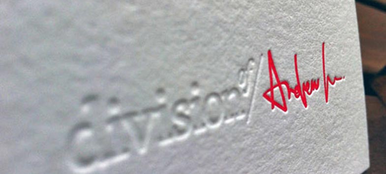
letter press business cards
Source


Add extra style and “pop” to your awesome business card by using a letter press indentation or embossing. Show off some flair and let client’s know you are trendy and fashionable.

Rounded Business Cards
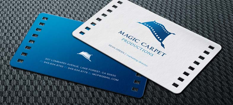
rounded business cards
Source


Coupled with other design elements, rounded corners and cuts in your card can have a lasting impact that demonstrate your company has an eye for detail.

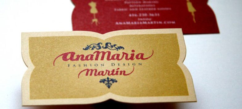
Unusually Shaped Cards
Source
Source


Rounded corners are one thing but using an unusual shape for your business card gives it a whole new dimension. Don’t get too wacky though, especially if you want clients to take you seriously.

USB Business Card

USB business cards
Source


Who in their right mind would throw away a flash USB drive? I wouldn’t! Give clients the impression that your business is doing SO well and you have the cash to splash, by giving away electronics.

Other Amazing Business Card Design Ideas

Your card can be made out of other unique materials rather than paper or plastic. How about:

  • Cotton business cards,
  • Magnetic business cards,
  • Aluminum business cards,
  • Wooden business cards,
  • Sponge business cards (yes, really!).

Bonus Tips

Allow for White Space

Don’t design your card with so much information that you have to use a tiny font size. Make sure your card has a good amount of white space to give the design some breathing room. I find sparsely populated cards look best.

Additionally, if you have a 2 sided business card, leave space on at least one side for clients to write notes on. You may also want to sign your card before giving it to clients for that personal touch.

Avoid Double-Sided Glossy Business Cards

A glossy finish to your business card often looks good, but they are near impossible to write on. Make sure to keep at least one side of your card in a matte finish.

Readers, let us know in the comment section about some awesome business cards you have received or created yourself.

Disclaimer: Links to 3rd party sites included within this article denoted with /go/ in the URL may result in commission being earned if you decide to make a purchase.
Shape And Cut Business Card

Creative Business Cards With Less Clutter Show More Class


When you have just met a potential customer, handing over visually appealing and creative business cards instead of a cluttered plain business card can mean the difference between getting a sale and seeing your business card go straight into the bin.

Everyone in business is familiar with business cards, ones with both good and bad designs.

Business card design is important because first impressions last. A horrible design can make the recipient feel like your business doesn’t have much authority, leading to a lack of respect for your business.

Creative business cards are not just about the graphics and layout. Creative business cards take into account the actual material of the card, the card thickness and shape.

We discuss business card materials in detail at Amazing Business Card Design Ideas That Clients Wont Throw Away

Graphic Design Of Creative Business Cards

You probably have a few business cards scattered around your office or in your desk drawer. Take a good look at them. Notice which cards immediately stand out and shout “classy”. Throw away the rest.

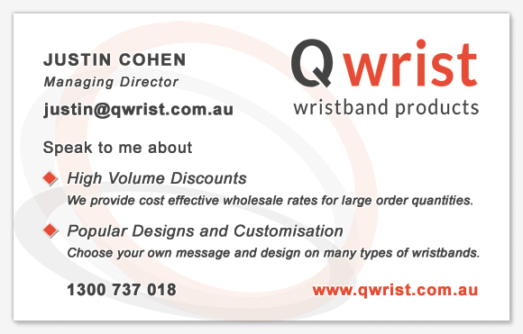
Here is a card I designed a while ago. It’s double-sided.

creative business cards

Some things you should take note of are:

  • Type of font and the size relative to the card and amount of text,
  • The white-space around the logo and blocks of text,
  • The line height of blocks of text (the space between lines),
  • Color usage in text, background and logo,
  • Position of logo, phone number, email address, person’s name,
  • Whether the card has a double-sided design.

This is the other side of my card.

creative business cards

If you design your own card, they can be printed professionally online by companies like Uprinting.

Creative business cards don’t need to be packed full of information, which can make the design look cluttered. In my particular case, I decided not to include a postal address on my business card. Why? I typically do business through email, so I felt the website and email address were more important.

Creative Business Cards Have Great Logos

A well-designed logo can have a large impact on the perception of your business. The same applies for badly designed logos giving a bad impression. It is better to have no logo at all than to have a badly designed one.image

If you’re not the creative type, you can purchase a ready-made logo online through 99 Designs and have it customized by the designer to your requirements.

I did this for the Qwrist logo and couldn’t be happier with the results.

Once you have a great logo, it can take pride of place on your business cards, website, social media profile pictures, stationery and promotional material. Logos are pretty important, so get it designed by a professional.

Creative Business Cards Are A Marketing Tool

Your business card is not just a piece of paper with contact information on it. It’s marketing material.

While you’re talking to a potential customer about the benefits you can offer them, by the time they get home, that information has vanished from their memory.

Make sure your creative business cards include a succinct summary of the benefits your business offers. If you don’t have the space on the main side of your business card, put this on the back.

Should You Include An Email Address ?

Dumb question, right? Well, that depends.

Yes, should absolutely should include your email address under only one condition: You have a personalized email address with your own domain name, not a free address like imanamateur71@gmail.com or your internet service provider.

Professionalism speaks volumes. If you don’t have a website, that’s not such a big deal. You could include your Facebook page address instead – as long as you frequently post valuable updates.

But you absolutely should have a personalized email address with your own domain name included on your business card.

That is, [email protected]

You can register a cheap domain at GoDaddy and setup an email address relatively quickly.

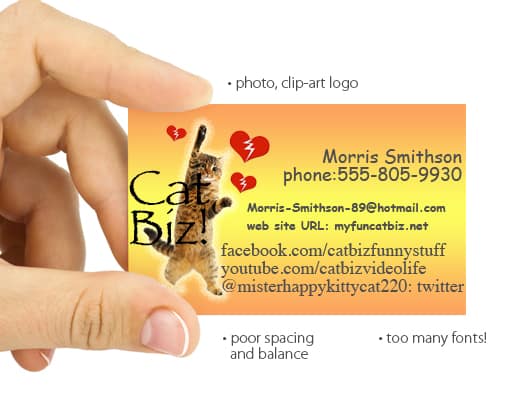
Let’s look at a badly designed card.

bad business card design

Source

  • Photographs rarely work well on business cards,
  • Avoid using clipart images,
  • Avoid high contrast background gradients (single color works best),
  • Keep blocks of text aligned both vertically and horizontally to other elements.

Creative business cards with a well balanced design along with an awesome logo for your business goes a long way to impressing potential customers. A great business card will result in more sales as well as more respect for you and your business.

What other tips do you have for designing creative business cards?

Disclaimer: Links to 3rd party sites included within this article denoted with /go/ in the URL may result in commission being earned if you decide to make a purchase.

Posts related to Creative Business Cards With Less Clutter Show More Class

Amazing Business Card Design Ideas That Clients Wont Throw AwayimageWhy You Should Cut Your Business Credit Cards In Halfimage21 Amazing Facts About The InternetimageCost Of Press Release - 5 Do's And 5 Don'ts To Save You Moneyimage

Tags:  business cardbusiness card design ideasbusiness cardscreative business cards

inscribd

List of Quotes Inspiring You to Be Better and Gain Skills

Copyright © List of Quotes Inspiring You to Be Better and Gain Skills